Prove Your Hypothesis Wrong
How the scientific method survived my move from the research lab to shipping software, and why it’s still one of the most useful tools I own.

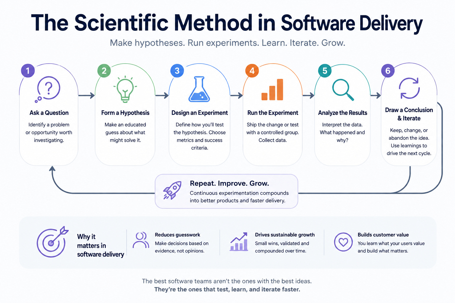
The scientific method is known to anyone who recalls science class from school. At its heart is the idea that to accept anything as factual, or to the best of our knowledge true, we must first attempt all reasonable efforts to prove our hypothesis false.
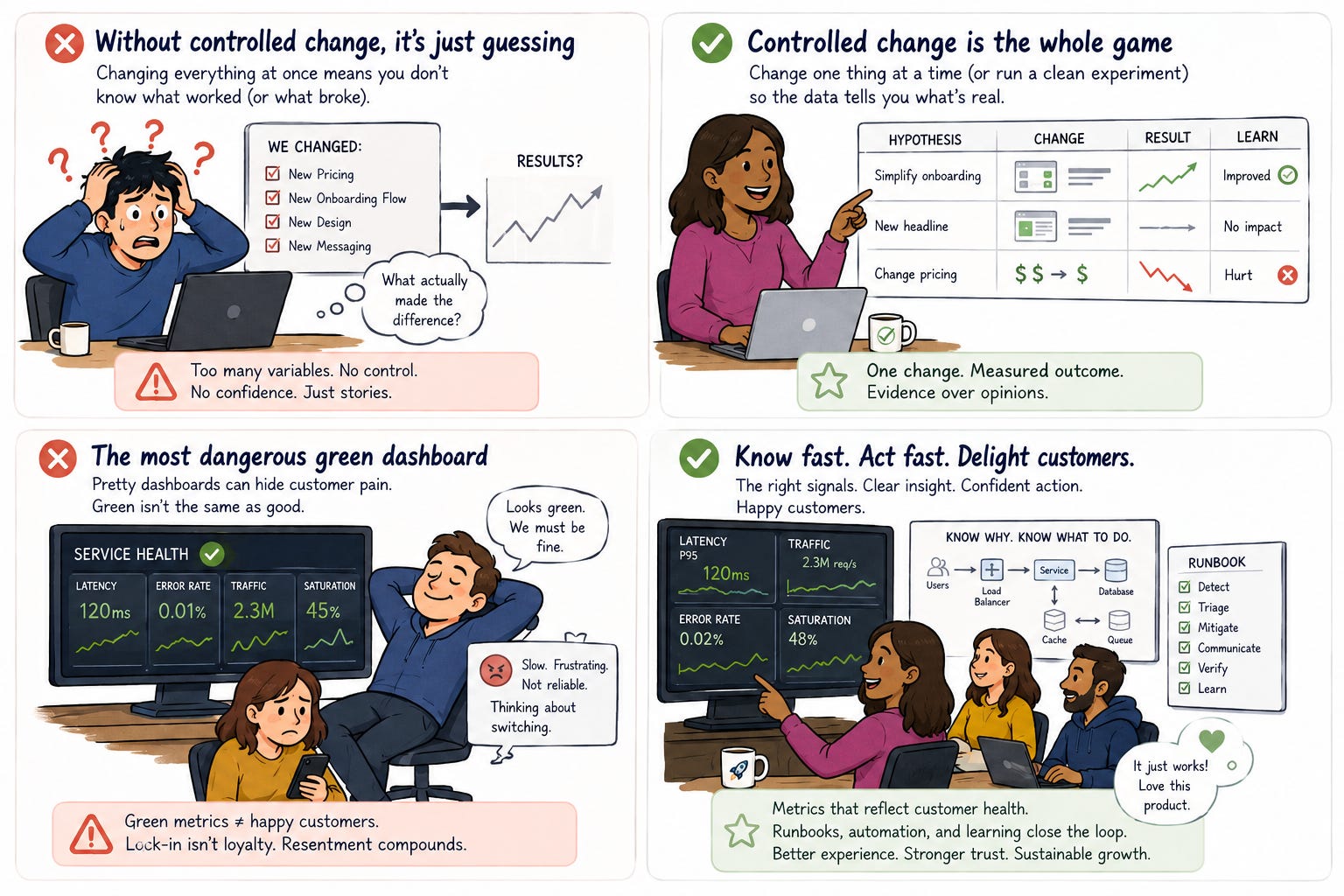
If you’ve ever been in the middle of a critical incident and not had clear insights into the root cause of an issue, it is deeply tempting to ship a fix with several changes in it, and hope one of them fixes the issue and gets you out of the terrible place you’re in at that moment. Later you can test and help prove your assumptions but at the moment you may feel like you don’t have time to test all the possibilities before shipping. If you’re right, you take a sigh of relief and hope this never happens again. News flash, it will if you don’t learn from it and take actions to prevent it. If you’re wrong, you’ve introduced more variables into the problem and now have a bigger mess. I have mountains of data and experience on how to avoid incidents and make responding to them less painful but that’s for other articles. For now let’s focus on the easiest hypothesis to test in most situations. When was your system or service last good? When was the last time it worked as expected and how fast can we get to that state? The goal being, once in a good state we can isolate the changes between then and the bad state and rule them in or out sequentially and independently as the root cause by following the scientific method. Ideally this happens in a non-production environment or in a fail-fast limited blast radius subset of production traffic driven by canaries or synthetics.
The same holds true for product experimentation and A/B testing. If you don’t have controls and carefully monitored metrics to determine if your experiment showed a positive result against your baseline, or worse you don’t have a baseline, you can’t clearly attribute the results to the hypothesis you had. You may end up spending too much on development or marketing and end up with a feature with no or negative ROI.
The scientific method gets taught as a tidy loop: question, hypothesis, experiment, conclusion. But its real engine isn’t the part where you prove something true. It’s the part where you try as hard as you can to prove it false. You hold a belief only after it has survived your most determined attempt to break it. That’s Karl Popper’s idea of falsifiability, and it’s the closest thing I have to dogma at work.[1]
From the bench to the build
My first professional developer experience was at an academic healthcare setting. College, grad school, and my early career were spent in research labs. As genomics work moved from the bench into software and enormous data sets, I drifted from pipetting into programming, and eventually into software delivery work full time. At the time, waterfall SDLC was the default, “agile” was the new thing nobody had quite figured out but they seemed intense and they had a manifesto, and Y2K was the apocalypse on the calendar.
What carried over from the lab wasn’t a recollection of organic chemistry. It was the discipline. In a lab, you do not get to change four experiment variables at once and publish a conclusion. You must carefully measure experiment variables against controls. In software, nothing physically stops you, and that’s precisely the danger. Every release, every refactor, every “while I’m in here I’ll also fix this” is a chance to introduce uncontrolled change and then tell yourself a flattering story about what happened.
Ideally, you have a great deployment pipeline and things like shift-left, automated gates, limited blast radius are commonplace in your culture and ecosystem, but odds are they are not and you wish you had them but there’s never enough time. If that’s the case you have to start somewhere just like scientific experimentation. Form a hypothesis of what would make your systems more resilient and easier to support and test them individually. Work them into your sprints or whatever delivery cadence you use one at a time, start small then gain momentum. I like to think of test coverage and CI/CD gates as mini-experiments along the delivery pipeline. If your change passes all the experiments designed to make it fail you shipped something good.
Valuable, not Viable
As continuous integration and delivery matured, so did the vocabulary: MVP, incremental delivery, build-measure-learn.[2] All of it good. But I’ve watched the “V” in MVP quietly betray teams. Viable is a word about you: what you consider minimally shippable. If your customers look at your minimum-viable thing and see no value in it, your definition doesn’t matter. You still failed.
So my teams used a different word: Valuable. What is the first complete slice of this product we can get fully into a customer’s hands that demonstrates real value, and, more importantly, produces the “oh, I see” moment, where they suddenly grasp the potential of what we’re building for them.
That slice is a hypothesis. The PR-FAQ, the PRD, the one-pager (whatever artifact you use) exists to state that hypothesis clearly enough that stakeholders can trust the plan and delivery teams know exactly what ships first.[3] The full picture matters too, but everyone agrees up front that it will change as we learn. Stating the hypothesis cleanly is what makes it testable.
Controlled change is the whole game
Here’s the part teams skip. Testing your hypothesis has to be constant, but the things you change to test it have to be controlled.
You cannot change four factors and assume each contributed equally. You also can’t assume one of the four did all the work. You have to vary things sequentially, or run parallel studies against rigorous controls, or your results mean nothing. This is not pedantry; it’s the difference between knowing and guessing.
A/B testing, beta programs, product experimentation, continuous discovery: every one of these works for the same reason a clean experiment works. Someone is holding the variables steady, measuring the outcome, and adapting the product to the data instead of to the story they wanted to tell.
Four graphs or less
At AWS, I had the privilege of leading a launch team for a new service at re:Invent. New launch teams usually run into delivery timeline challenges over launch checklists or staffing, but the thing almost all of them underestimate is operational readiness. Can your service launch in concert with every other service, be fully compliant with standards, and be robust enough to absorb massive, globally distributed traffic on day one?
The hardest question I put to my team was deceptively simple: how do we know our service is healthy in four graphs or less?
The number four is arbitrary; the constraint is the point. Monitoring vendors will happily sell you a wall of dashboards that feel like peace of mind. But a green health check doesn’t tell you a customer succeeded. So we ran the scientific method on our own monitoring: if we assume the service is in perfect working order and hundreds of thousands of customers are happily using it, which metrics would prove that true, and which would prove it false?
The low-hanging fruit can lie to you. No 5xx errors? That’s not a complete answer. If the service is fully down, you get no codes back at all. Latency over SLO? Real problem, but is it a handful of outliers, or malicious traffic dragging the tail while everyone else is fine? Each metric you trust has to survive interrogation, and you refine the set as you learn. Add to that the scale of AWS, every Region and the Availability Zones within each one, and you need something simple enough to repeat easily but thorough enough to be surgical in detection and response.
I later learned that Google’s SRE team had canonized this exact instinct as the Four Golden Signals (latency, traffic, errors, and saturation): the minimum set they’d watch if they could only watch four things.[4] I think they’re mostly right, and I’d add one wrinkle. Their four describe system health. The four I cared about had to describe customer health. A monitor or dashboard can be green while the person depending on what it is monitoring is quietly suffering. This is a shared experience for anyone ever receiving the vendor explanation of “some customers are experiencing increased latencies”. I get why they say that, it’s true and helps companies maintain legal protections, but also we (customers) all know something big is down and we’re not the lucky ones with mere delays. The “delay” verbiage on these massive outages really means a service is down, but eventually vendors know they’ll come back and your request will complete. It’s accurate but feels hollow and always disappoints.
On the other hand, if you’re the team operating the service, you want to know exactly what’s wrong as fast as possible and what all your upstream and downstream dependencies are. Knowing this before you launch helps templatize your response and optimize how long it takes to recover. If you did your homework and approached service health scientifically, you know why it isn’t healthy and what actions to take. You have metrics, runbooks, automations, and dashboards. You can quickly jump to action and resolve customer pain swiftly. The alternative is you’re mostly blind, struggling to reproduce, your customers detect issues before you do, and you’re stuck in a guess-and-check mindset of an outage where you try one thing, shrug, and try something else. Those calls suck and no one wants to be on them.
This, by the way, is also why postmortems, RCAs, and Correction-of-Error reviews matter. A real postmortem is a forced attempt to disprove the hypothesis “we understand why this broke and can prevent it from happening again.” If your root cause analysis, 5 whys, or whatever mechanism you use survives that, you’ve learned something. If it doesn’t, you’ll likely be having the same unpleasant conversation over and over again.
The most dangerous green dashboard
Eventually, through all your observations of customer patterns and service behavior, you arrive at a small set of metrics that genuinely reflect whether your customers are thriving on your product or suffering through it. That second case is the expensive one. It’s where you lose value, and value is the whole reason any of this exists.
The seductive escape hatch is to tell yourself the suffering customers are locked in, because switching vendors is hard. Resist it. A trapped, miserable customer is the most dangerous reading on your whole dashboard: a false positive. Your charts say green; the relationship is rotting. Lock-in doesn’t buy loyalty, it just defers resentment, and resentment compounds.
So interrogate your happiest-looking number the hardest. “My customers are satisfied” is the single most important hypothesis you’ll ever hold, which is exactly why it deserves your most determined effort to prove it false. The method that got me out of the lab still earns its keep every single day.
[1]: Karl Popper, The Logic of Scientific Discovery (1959; first published in German, 1934). Popper argued that what makes a claim scientific is that it can be falsified, and that we should actively seek to refute our hypotheses rather than confirm them.
[2]: Eric Ries, The Lean Startup (2011). The source of the modern MVP and the build-measure-learn loop, useful here precisely as the idea this essay pushes back on.
[3]: Colin Bryar & Bill Carr, Working Backwards: Insights, Stories, and Secrets from Inside Amazon (2021). The canonical inside account of the PR-FAQ and Amazon’s working-backwards process.
[4]: Google, Site Reliability Engineering: How Google Runs Production Systems (2016), ch. “Monitoring Distributed Systems.” The Four Golden Signals are latency, traffic, errors, and saturation. Free online at sre.google/sre-book.